Responsive web design has become a fundamental requirement for modern businesses. With a large share of online traffic coming from smartphones and tablets, your website must function smoothly on every screen size. A responsive website not only improves user experience but also boosts search visibility, increases conversions and strengthens your brand credibility.
If a website looks broken on mobile or takes too long to load, users leave instantly. To ensure that your audience stays engaged and completes the actions you want, it is essential to follow the best practices of responsive design. Below are ten important and practical techniques every business should implement.
1. Start with a Mobile-First Approach
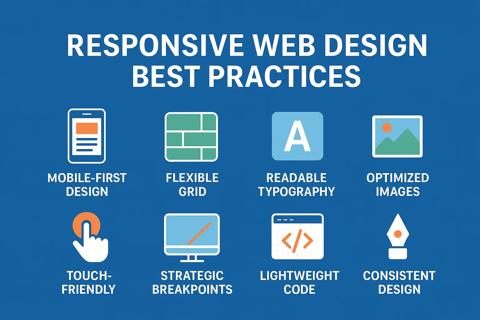
Instead of beginning with desktop layouts, design for mobile screens first. This helps you focus on simplified navigation, essential content hierarchy and faster loading performance. Since Google uses mobile-first indexing, mobile performance also influences search rankings.
2. Implement a Flexible Grid System
A responsive grid layout dynamically adjusts elements to fit any screen size. Using relative units such as percentages rather than fixed pixels ensures that images, text and containers scale proportionally. This approach prevents layout distortion and improves readability across devices.
3. Make Typography Readable Everywhere
Text should not require zooming or excessive scrolling. Choose a font size that is comfortable on smaller screens, maintain proper line height and allow text to adjust automatically. Test headings, paragraphs and CTAs on multiple screens to ensure visual balance.
4. Optimize Images for Faster Page Speed
High-resolution images can drastically slow down a site. Use modern formats like WebP, compress images without quality loss and set responsive image breakpoints so devices only load what they need. Speed improvement directly enhances SEO and user retention.
5. Ensure Touch-Friendly Navigation
Buttons, menus and interactive elements should have enough space to prevent accidental clicks. Avoid tiny icons or dense menu structures. A mobile visitor should be able to reach the main pages and CTAs easily with one hand.
6. Use Breakpoints Strategically
Breakpoints allow your layout to adjust based on device width. Focus on common screen sizes such as smartphones, tablets and laptops. Test design behavior at each breakpoint to ensure a smooth transition and to prevent overlapping elements.
7. Enhance Page Performance with Lightweight Code
Avoid heavy scripts, excessive CSS and unnecessary third-party elements. Minify CSS and JavaScript and focus on a clean architecture. Faster performance leads to better user engagement and positive search ranking signals.
8. Maintain a Consistent User Experience
Brand consistency should be visible across all devices. Uniform color patterns, fonts, spacing and button styles help users recognize your brand instantly. Consistency builds trust and supports a polished professional appearance.
9. Test Across Real Devices and Browsers
Do not rely only on desktop simulation tools. Manually test your website on popular devices like iPhone, Android, iPad and various laptops. Also confirm compatibility with major browsers including Chrome, Safari and Firefox. Real testing uncovers hidden usability issues.
10. Prioritize Accessibility at Every Step
A responsive website should also be accessible to users with disabilities. Use proper contrast levels, readable fonts, alt text for images, keyboard navigation support and clear headings. Following accessibility guidelines improves inclusivity and complies with global standards such as WCAG.
Why Responsive Design Matters More Than Ever
Users expect flawless browsing experiences regardless of the device they use. A responsive website helps businesses achieve the following benefits:
- Better visibility in search engine results
- Reduced bounce rates and better conversions
- Higher customer satisfaction and brand trust
- Future-proof design compatible with new devices
Responsive web design isn’t a trend. It is a long-term investment that supports growth, visibility and customer engagement.
Final Thoughts
Building a responsive website means creating an adaptable digital presence that works for every user. Businesses that adopt these best practices gain a strong competitive advantage and deliver exceptional user experiences across all platforms.
If you need help with a high-performing responsive website for your business, Pointer Soft Technologies can assist with modern, scalable and mobile-friendly web solutions tailored to your goals.
Frequently Asked Questions (FAQs)
1. What is responsive web design?
Responsive web design is an approach where websites automatically adjust layout and content to fit different screen sizes and devices such as mobile phones, tablets and desktops.
2. Why is responsive design important for SEO?
Google uses mobile-first indexing, meaning your site’s mobile version is primarily evaluated for rankings. A responsive site improves speed, user experience and search performance.
3. How do I know if my website is responsive?
You can resize your browser window or test your website on multiple devices. Google’s Mobile-Friendly Test tool also helps check responsiveness.
4. Does responsive design improve conversions?
Yes. A website that loads quickly and displays properly encourages users to stay longer, interact more and complete actions such as inquiries or purchases.
5. How often should a website design be updated?
Most businesses update their websites every 2 to 3 years to ensure compatibility with evolving design trends, technologies and user expectations.