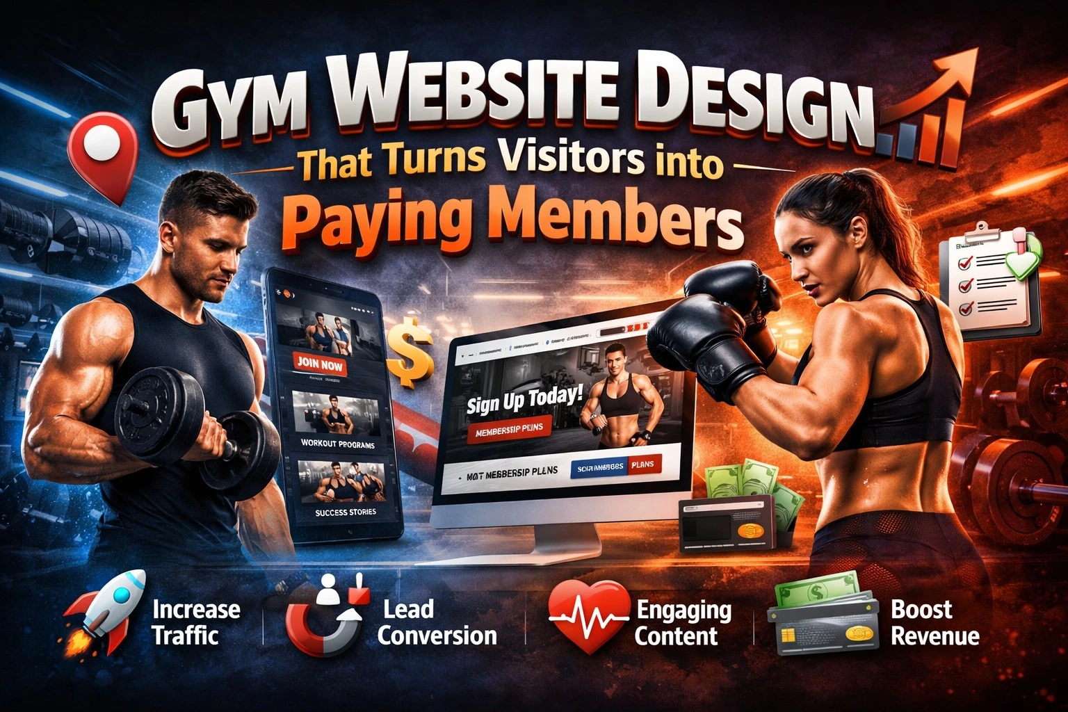
Most gym owners invest in equipment, trainers, and promotions but still struggle to convert website visitors into actual members. The issue usually is not traffic. It is the website experience. A gym website should work like a digital salesperson. It should build trust, answer questions, remove doubts, and push visitors to take action.
A well-designed gym website does not just “look good.” It guides potential members step by step toward booking a trial session or signing up for a membership. Let’s break down how the right website design can directly increase your gym memberships.
Why Gym Website Design Matters More Than Ever
People search online before they step into any fitness center. They compare facilities, trainers, pricing, reviews, and photos. If your website looks outdated or confusing, they assume your gym is the same. A strong gym website helps you:
• Build instant credibility
• Showcase your facilities and success stories
• Answer common questions before people call
• Capture leads 24/7
• Convert interest into paid memberships
Your website should make joining your gym feel easy, exciting, and trustworthy.
Key Website Design Elements That Drive Membership Signups
1. Clear Value Proposition on the Homepage
Your homepage has only a few seconds to convince visitors they are in the right place. Most gym websites waste this space with generic lines like “Welcome to Our Fitness Center.” That does not answer the visitor’s real question: “What will I achieve here?”
A strong value proposition clearly states the result people can expect. It should focus on transformation, support, and outcomes rather than just facilities. When visitors immediately see benefits such as weight loss programs, strength training guidance, or personalized coaching, they feel understood. This emotional connection keeps them exploring instead of leaving. Your headline, subheading, and hero image must work together to communicate one clear promise better fitness results with your help.
2. High-Quality Images and Real Videos
Fitness decisions are emotional and visual. People want to picture themselves in your gym before they ever visit. Low-quality or stock photos create doubt. Real photos build trust. Show clean workout areas, modern machines, active group classes, and friendly trainers. These visuals reduce fear and uncertainty, especially for beginners who may feel intimidated. When visitors see people like them training in your gym, they feel more comfortable taking the next step.Short videos make an even stronger impact. A quick walk through of your gym or a trainer explaining programs makes your business feel real and welcoming.
3. Mobile-First Design
Most people searching for gyms are on their phones, often while commuting or scrolling through social media. If your website is hard to use on mobile, they will leave within seconds. Mobile-first design means large readable text, fast loading pages, and buttons that are easy to tap. Forms should be short and simple, asking only for essential information like name, phone number, and preferred time for a trial session. When the mobile experience feels effortless, visitors are more likely to complete actions such as booking a trial or calling your gym.
4. Strong Call-to-Action (CTA)
A visitor should never wonder what to do next. Your website must guide them clearly toward becoming a lead or member.
Strong CTAs use action-focused language like “Book a Free Trial,” “Start Your Fitness Journey,” or “Join Today.” These buttons should stand out visually and appear multiple times on important pages, not just once at the bottom. Placement matters. When users see a CTA right after reading about benefits or viewing transformation stories, they feel motivated to act immediately. Clear direction removes hesitation and increases signups.
5. Membership Plans Made Simple
Confusing pricing drives people away. If visitors cannot quickly understand what they get and how much it costs, they postpone the decision.
Present membership options in a simple structure that highlights who each plan is best for. Focus on benefits rather than just price. For example, instead of only listing “3-Month Plan,” explain that it includes group classes or trainer guidance. Clarity builds confidence. When people understand their options easily, they feel more comfortable moving forward instead of leaving to “think about it.”
6. Social Proof and Testimonials
Joining a gym feels like a big personal commitment. People want reassurance that others have succeeded before them. Testimonials provide that reassurance. Feature real member stories, transformation photos, and short quotes about positive experiences. Reviews that mention supportive trainers, clean facilities, or visible results influence decisions strongly.
Social proof reduces risk in the visitor’s mind. When they see others achieving results, they believe they can too. This emotional confidence often becomes the final push toward signing up.
7. Easy Contact and Lead Capture Options
Even interested visitors may delay action if contacting you feels complicated. Your website should make communication effortless.
Visible phone numbers, click-to-call buttons, WhatsApp chat options, and quick enquiry forms allow people to reach you in the way they prefer. The easier it is to contact your gym, the more leads you will capture. Speed matters here. When someone feels motivated to start their fitness journey, you want them to act immediately, not later when motivation fades.
Case Study: How Better Website Design Increased Gym Memberships
A mid-sized fitness center in Delhi struggled to convert website visitors into leads. They were running social media ads but saw very few membership inquiries.
Problems on Their Old Website
• Slow loading speed
• No clear membership information
• No strong call-to-action
• Outdated design with poor mobile experience
Changes Made
The gym redesigned its website with a conversion-focused approach. They added a strong homepage headline, professional gym photos, clear pricing tables, and a prominent “Book Free Trial” button on every page. They also improved mobile speed and added member testimonials.
Results After 3 Months
| Metric | Before Redesign | After Redesign |
| Monthly Website Visitors | 2,800 | 3,100 |
| Monthly Trial Bookings | 35 | 120 |
| Membership Signups per Month | 18 | 64 |
| Conversion Rate (Visitor to Lead) | 1.2% | 3.8% |
Traffic increased slightly, but conversions improved dramatically. The website started acting like a full-time sales assistant.
How Design Supports Your Marketing
Many gym owners spend money on ads and social media promotions. But if the website does not convert, that marketing budget goes to waste. Good website design acts like a conversion engine that turns attention into action. Let’s break down how design directly supports your marketing performance.
1. Supports Facebook and Google Ads
When you run paid ads, you are buying attention. But attention alone does not bring memberships. Your landing page must continue the promise made in the ad. If someone clicks an ad that says “Get 7 Days Free Gym Trial” and lands on a homepage with no mention of the offer, they feel confused and leave. That wasted click still costs you money. A conversion-focused gym website design ensures:
• Dedicated landing pages for offers
• Clear headline that matches the ad message
• Simple form to book the free trial
• Fast loading speed to reduce drop-offs
2. Converts Social Media Visitors into Leads
Instagram and Facebook are powerful for fitness businesses because transformation stories, workout videos, and trainer content attract attention. But social media rarely closes the sale on its own. When someone visits your profile and clicks your website link, they are already interested. Your website design should capture that interest immediately.
Strong design helps by:
• Showing real member transformations
• Displaying class schedules and facilities clearly
• Highlighting trial offers above the fold
• Making contact buttons easy to tap on mobile
3. Builds Trust Before People Visit Your Gym
Most people feel nervous about joining a new gym. They worry about crowd levels, cleanliness, trainer quality, and whether they will fit in. Your website design should remove these doubts before they ever walk in. Design builds trust through:
• Professional layout and modern visuals
• Real photos of equipment and workout areas
• Trainer profiles with certifications and experience
• Member testimonials and success stories
4. Helps You Stand Out from Local Competitors
In most areas, people compare multiple gyms before choosing one. If your competitors have outdated or poorly structured websites, a modern, conversion-focused design gives you a big advantage. A strong website makes your gym look:
• More professional
• More established
• More serious about member results
5. Improves SEO Performance
Search engine optimization does not depend only on keywords. Google also evaluates user experience. A well-designed gym website improves important SEO signals. Good design supports SEO by:
• Improving page load speed
• Making the site mobile-friendly
• Creating clear page structure and navigation
• Reducing bounce rate because visitors find information easily
When users stay longer and interact with your site, search engines see your website as helpful and rank it higher. Better rankings bring more local traffic, which your design then converts into leads.
6. Turns Traffic into Measurable Leads
Marketing success should not be measured only by clicks or visitors. What matters is how many people actually enquire or sign up. Conversion-focused design includes:
• Trial booking forms
• Click-to-call buttons
• WhatsApp chat integration
• Easy contact pages
7. Increases Return on Every Marketing Rupee
Every rupee you spend on ads, SEO, or social media drives people to your website. If your website converts at a low rate, you need more traffic and higher spending to get the same number of members. When your website design improves conversion rates:
• You get more leads from the same traffic
• Your cost per lead decreases
• Your marketing becomes more profitable
FAQ
1. How often should a gym update its website design?
You should refresh your website every two to three years. Update photos, testimonials, and offers more frequently to keep content current.
2. What is the most important feature of a gym website?
A clear call-to-action for booking a trial session is the most important feature. Without it, visitors may leave without taking any action.
3. Should I show membership prices on my gym website?
Yes, showing starting prices builds trust and filters serious inquiries. You can still invite visitors to contact you for detailed plans.
4. How does website speed affect gym memberships?
Slow websites increase bounce rates. If your pages take too long to load, visitors leave and join another gym with a faster site.
5. Can a website really increase gym memberships?
Yes. A well-designed website builds trust, answers questions, and pushes visitors toward booking a trial, which leads to more memberships.
Final Thoughts
Your gym website should not act like a digital brochure. It should work like a salesperson who never sleeps. When you focus on clear messaging, strong visuals, mobile-friendly design, and a conversion-driven structure, your website becomes a powerful membership-generating tool.
If visitors land on your site and instantly see professionalism, real results, and an easy way to join, they are far more likely to walk through your gym doors and become paying members. This is exactly why many growing fitness businesses now invest in expert-led website design that blends branding, performance, and lead generation. Working with an experienced team like Pointer Soft Technologies can help ensure your gym website is not just attractive, but strategically built to turn online interest into real-world memberships.