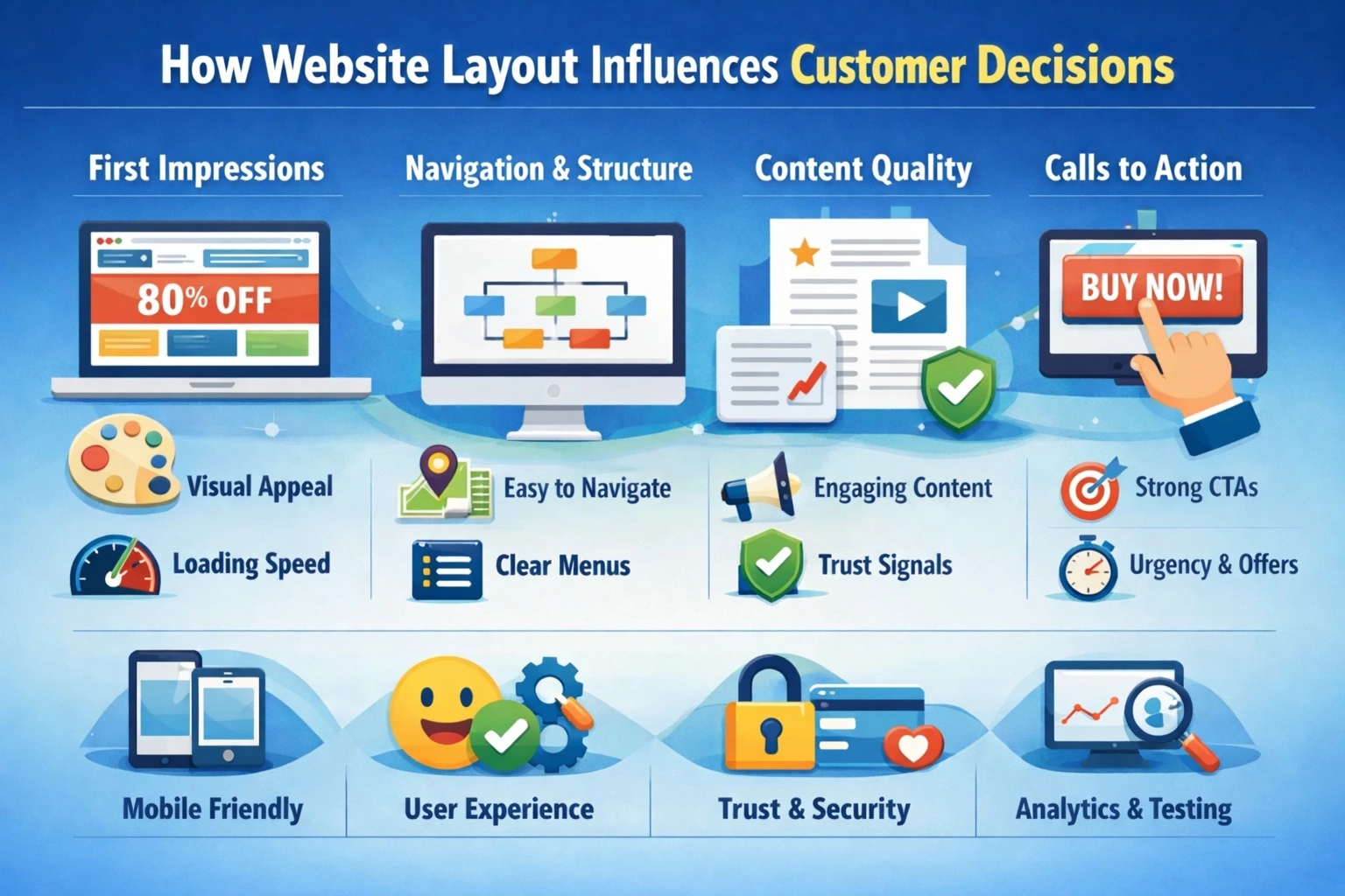
Are visitors leaving your website without taking any action? Many businesses struggle with high bounce rates, low form submissions, and lost leads simply because their website layout confuses or overwhelms users. While colors, images, and content matter, the layout of your website plays the biggest role in influencing customer decisions and driving lead generation. A strategically designed layout makes navigation intuitive, highlights the right call-to-actions (CTAs), and guides visitors toward taking action.
That’s why working with a professional website designing company is crucial. With the right expertise, you can ensure your site not only looks visually appealing but is also optimized for user engagement and lead generation, combining design, layout, and functionality seamlessly.
Why Website Layout Matters for Customer Decisions
Website layout is more than aesthetics; it’s about guiding the user journey. Research shows that 94% of first impressions are design-related, and confusing layouts make visitors leave within seconds.
1. Visual Hierarchy
Visual hierarchy is about guiding the user’s eyes to the most important elements first. By adjusting size, color, and placement, businesses can make headlines, offers, or CTAs stand out. Visitors naturally notice prominent elements before secondary ones, helping them quickly understand your value and take action.
2. Navigation Flow
Navigation flow ensures that visitors can move through your website easily. Clear menus, categorized sections, and logical page order reduce confusion, prevent frustration, and help users find the information they’re looking for. A smooth navigation flow keeps visitors engaged longer and encourages them to explore your services.
3. Call-to-Action (CTA) Placement
CTAs tell visitors what action to take next, like “Contact Us,” “Get a Quote,” or “Book a Demo.” Placing CTAs in prominent positions above the fold, at the end of content, or in sidebars guides visitors toward conversion. Proper placement ensures your website doesn’t just inform but actively generates leads.
4. Content Alignment
Content alignment is about how text, images, and whitespace are arranged on a page. Well-aligned content improves readability, reduces visual clutter, and makes important information easier to scan. Balanced layouts keep visitors engaged longer and make the website feel professional and trustworthy.
Case Study: Website Layout Impact on Lead Generation
A mid-sized B2B service company was struggling to convert website visitors into leads. Despite having quality content and services, their website showed:
- High bounce rate (65%)
- Low session duration (1:20 minutes)
- Minimal contact form submissions (25/month)
- Low CTA engagement (8%)
Solution Implemented
We applied a data-driven layout strategy focusing on:
- Visual Hierarchy – Highlighted key services and offers above-the-fold.
- Navigation Flow – Simplified menus and organized service pages logically.
- CTA Placement – Added prominent buttons for “Get a Quote” and “Contact Us.”
- Content Alignment – Balanced text, images, and whitespace for readability.
- Mobile Optimization – Ensured seamless experience on all devices.
- Performance Enhancements – Optimized page speed and loading time.
Results
After implementing the new layout, we measured performance over 3 months:
| Metric | Old Website Layout | Redesigned Layout | Improvement |
|---|---|---|---|
| Bounce Rate | 65% | 42% | -23% |
| Average Session Duration | 1:20 mins | 2:15 mins | +55% |
| Contact Form Submissions | 25/month | 68/month | +172% |
| CTA Click Rate | 8% | 21% | +162% |
| Page Load Time | 3.5s | 1.8s | -49% |
Key Insights
- Clear hierarchy and highlighted CTAs significantly increased visitor interaction.
- Simplified navigation reduced confusion, keeping users on the site longer.
- Faster page load time improved engagement and boosted session duration.
- Mobile-friendly layout ensured a smooth experience for all users.
Best Practices for Designing a Layout That Converts
1. Prioritize Above-the-Fold Content
“Above the fold” is the part of the webpage visitors see without scrolling. Placing essential information, headlines, and CTAs here ensures users notice it immediately, increasing the chances of engagement and conversions.
2. Use F-Pattern or Z-Pattern Layouts
These layouts follow natural eye movement patterns. In F-pattern, users scan horizontally at the top and down the left; in Z-pattern, the eyes move in a zigzag. Designing pages according to these patterns guides users to key messages and CTAs efficiently.
3. Maintain Consistency Across Pages
Keeping navigation, fonts, colors, and branding uniform across all pages prevents confusion. Consistency builds trust and helps visitors feel comfortable, making them more likely to stay and interact with your website.
4. Highlight Key Offers
Important offers or CTAs should stand out using contrasting colors, bold text, or whitespace. This draws attention to the actions you want visitors to take, increasing the likelihood of clicks and conversions.
Common Mistakes in Website Layout That Reduce Leads
1. Overcrowded Pages That Confuse Visitors
Too much content, too many images, or too many buttons on a single page can overwhelm users. Overcrowded pages make it hard to focus, causing visitors to leave before taking any action.
2. Unclear or Hidden CTAs
If calls-to-action (CTAs) are buried, small, or confusing, visitors may not know what to do next. Hidden CTAs reduce conversions and result in lost leads.
3. Lack of Visual Hierarchy
Without a clear hierarchy, important information gets lost among secondary content. Visitors may miss key messages, offers, or CTAs, decreasing engagement and conversions.
4. Poor Mobile Responsiveness
With over half of website traffic coming from mobile devices, a site that doesn’t adapt to screens frustrates users. Poor mobile layouts lead to slow navigation, high bounce rates, and lost business opportunities.
FAQs
1. How does website layout affect customer decisions?
A good layout guides visitors’ eyes, reduces confusion, and encourages engagement with CTAs, increasing conversions.
2. What are the key elements of a conversion-focused layout?
Visual hierarchy, logical navigation, clear CTAs, consistent design, and responsive pages
3. Can layout changes improve leads without changing content?
Yes. Reorganizing elements, simplifying navigation, and highlighting CTAs can significantly increase leads.
4. How do I measure if my layout is effective?
Track metrics like bounce rate, session duration, CTA clicks, form submissions, and conversion rate. Heatmaps also help.
5. Does mobile layout affect lead generation?
Absolutely. With over 55% of traffic from mobile, responsive layouts are critical.
Final Thought
A thoughtfully designed website layout is more than just aesthetics it shapes how visitors perceive your business, navigate your services, and ultimately take action. Optimizing visual hierarchy, navigation, content alignment, and CTAs can turn casual visitors into engaged leads, improving conversions and business growth.
At Pointer Soft Technologies , we specialize in creating user-focused, conversion-driven websites that combine smart design with strategic layout planning. By focusing on clarity, responsiveness, and lead optimization, we help businesses not only attract visitors but also convert them into loyal customers. Investing in a professional website layout today is a step toward measurable online success tomorrow.