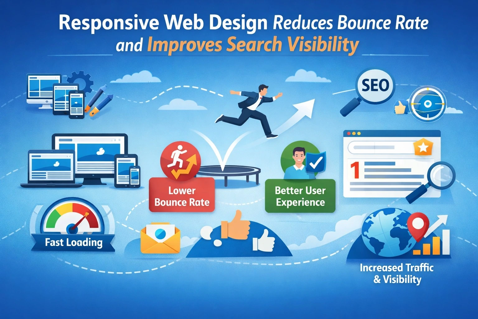
A visitor lands on your website, waits a few seconds, struggles to read tiny text, and leaves without clicking anything. That single action increases your bounce rate and signals to search engines that your site may not be delivering a good user experience. Responsive web design solves this problem and plays a direct role in improving both user engagement and search visibility.
Responsive Website design is no longer just a design trend. It is a performance, usability, and SEO strategy that helps websites adapt seamlessly to all devices, desktops, tablets, and smartphones. When your website responds well to different screen sizes, users stay longer, interact more, and convert faster. Let’s break down how responsive web design directly impacts bounce rate and search rankings.
What Is Responsive Web Design?
Responsive web design (RWD) allows a website layout, images, and content to automatically adjust based on screen size and device type. Instead of creating separate mobile and desktop versions, you build one flexible website that works everywhere.
Key elements include:
Fluid grid layouts
Fluid grids use relative units like percentages instead of fixed pixels. This allows the layout to stretch or shrink smoothly based on screen size, keeping content properly aligned on all devices.
Flexible images
Flexible images resize within their containing elements so they don’t overflow the screen. This prevents layout breaking and ensures visuals look clean on both large and small displays.
Media queries for screen adaptation
Media queries are CSS rules that apply different styles depending on device width, resolution, or orientation. They help adjust layouts, font sizes, and spacing to provide the best viewing experience on each screen type.
Mobile-friendly navigation
Navigation designed for mobile devices uses simplified menus, clear labels, and collapsible sections. This makes it easy for users to find what they need without excessive scrolling or tapping.
Touch-friendly buttons
Touch-friendly buttons are large enough and spaced properly so users can tap them easily without hitting the wrong option. This improves usability and reduces frustration on touchscreen devices.
How Responsive Design Improves Search Visibility
Search engines prioritize user experience. Google uses mobile-first indexing, which means it primarily evaluates the mobile version of your website for ranking.
1. Mobile-First Indexing Advantage
If your website works smoothly on mobile devices, Google can crawl and index your content more effectively. A responsive site ensures you do not miss ranking opportunities due to poor mobile usability.
2. Lower Bounce Rate = Positive Ranking Signal
When users stay longer and interact more, search engines interpret this as a sign of valuable content. Reduced bounce rate often correlates with improved dwell time and engagement metrics.
3. Faster Load Times Improve Core Web Vitals
Responsive optimization often includes performance improvements. Better loading speed and visual stability contribute to stronger Core Web Vitals scores, which influence rankings.
4. No Duplicate Content Issues
Separate mobile and desktop sites can cause duplicate content problems. A single responsive URL structure keeps your SEO authority consolidated.
Real Case Study: Local Service Business Website
A home maintenance company redesigned its non-responsive website into a fully responsive platform.
Problems before redesign:
- Text too small on mobile
- Slow image loading
- Buttons hard to tap
- High mobile bounce rate
After implementing responsive design, they tracked performance for 3 months.
Performance Comparison
| Metric | Before Responsive Design | After Responsive Design | Improvement |
| Mobile Bounce Rate | 68% | 39% | ↓ 29% |
| Average Session Duration | 52 seconds | 2 minutes 10 seconds | ↑ 150% |
| Pages Per Session | 1.3 | 3.1 | ↑ 138% |
| Mobile Conversion Rate | 0.8% | 2.6% | ↑ 225% |
| Organic Traffic (3 months) | 4,200 | 6,950 | ↑ 65% |
| Google Ranking (Main Keyword) | Position 18 | Position 7 | ↑ 11 spots |
The improved usability kept visitors engaged, which reduced bounce rate. Search engines picked up the stronger engagement signals, and rankings improved.
Additional SEO Benefits of Responsive Design
Improved Social Sharing
Most social media traffic comes from mobile devices. When users click a shared link and land on a mobile-friendly page that loads fast and looks clean, they’re more likely to stay, read, and share it further. If the page looks broken or hard to use on a phone, they exit instead of sharing.
Lower Maintenance Costs
With responsive design, you manage one website that adapts to all screens instead of maintaining separate desktop and mobile versions. This reduces development time, content duplication, testing effort, and future update costs.
Stronger Backlink Value
When all users access the same URL regardless of device, every backlink points to a single page. This consolidates domain authority and SEO value instead of splitting it between mobile and desktop versions.
Higher Conversion Rates
Responsive design creates smoother user journeys. Visitors can easily read content, click buttons, fill forms, and complete purchases on any device. Less friction means more completed actions.
Best Practices for Responsive Web Design
To maximize both engagement and rankings, follow these steps:
1. Use flexible grids instead of fixed-width layouts
Flexible grid systems allow page elements to resize proportionally based on screen size. This ensures your layout looks balanced on large monitors, tablets, and small smartphones without causing horizontal scrolling or broken sections.
2. Optimize images for different screen sizes
Large images slow down mobile websites. Responsive image techniques serve appropriately sized images depending on the device, which improves loading speed while still maintaining visual quality.
3. Prioritize page speed optimization
Users leave quickly when a page loads slowly, especially on mobile networks. Speed optimization includes compressing files, minimizing code, and using efficient hosting so pages load smoothly and keep visitors engaged.
4. Use readable font sizes (minimum 16px for body text)
Text that is too small forces users to zoom in, which disrupts the browsing experience. Proper font sizing and spacing improve readability, reduce eye strain, and encourage users to stay longer on the page.
5. Design thumb-friendly buttons and menus
Mobile users navigate with their thumbs, not a mouse cursor. Buttons should be large enough and spaced well to prevent accidental clicks, making navigation easier and more comfortable.
6. Test across multiple devices and screen resolutions
A website may look perfect on one device but broken on another. Testing on different screen sizes, browsers, and operating systems ensures a consistent experience for all visitors.
7. Avoid intrusive popups on mobile
Popups that cover the screen frustrate users and make content difficult to access. Search engines may also penalize sites that use intrusive interstitials, so keeping popups minimal and easy to close improves both usability and SEO.
Common Mistakes That Increase Bounce Rate
Even responsive sites can struggle if they include:
1. Heavy images that slow loading
Large, uncompressed images take longer to load, especially on mobile networks. Slow-loading pages frustrate users and often cause them to leave before the content even appears.
2. Poor contrast that reduces readability
Text that blends into the background or uses low-contrast color combinations makes reading difficult. When users struggle to read, they lose interest quickly and exit the page.
3. Overcrowded layouts on small screens
Too many elements packed into a small screen create visual clutter. Users feel overwhelmed and find it hard to focus or navigate, which increases the chances of them leaving.
4. Hard-to-close popups
Popups with tiny close buttons or confusing layouts frustrate visitors. If users cannot easily dismiss them, they often abandon the site altogether.
5. Auto-play videos with sound
Videos that start playing automatically, especially with sound, can annoy or startle users. This feels intrusive and often leads visitors to close the page immediately.
Conclusion
Responsive web design directly connects user experience with SEO performance. When visitors can navigate easily, read comfortably, and interact without frustration, they stay longer and explore more pages. These engagement improvements reduce bounce rate and send positive signals to search engines.
As mobile traffic continues to dominate, businesses that ignore responsive design risk losing both users and rankings. Investing in a responsive website is not just about appearance , it is a strategy that drives visibility, engagement, and conversions. Working with an experienced team like Pointer Soft Technologies can help ensure your website is not only visually responsive but also optimized for speed, usability, and long-term search growth.
FAQs
1. Does responsive design directly affect SEO rankings?
Yes. Responsive design improves mobile usability, page speed, and engagement metrics all of which influence search engine rankings.
2. How does bounce rate impact search visibility?
A high bounce rate can signal poor user experience. When users leave quickly, search engines may rank your page lower compared to pages where visitors stay longer.
3. Is responsive design better than a separate mobile website?
Yes. A single responsive site avoids duplicate content issues, simplifies maintenance, and consolidates SEO authority under one URL.
4. How can I test if my website is responsive?
You can resize your browser window or use mobile testing tools to see how your site adapts to different screen sizes.
5. How long does it take to see SEO improvements after redesigning responsively?
You may start noticing engagement improvements immediately, but search ranking improvements typically take a few weeks to a few months depending on competition and optimization quality.