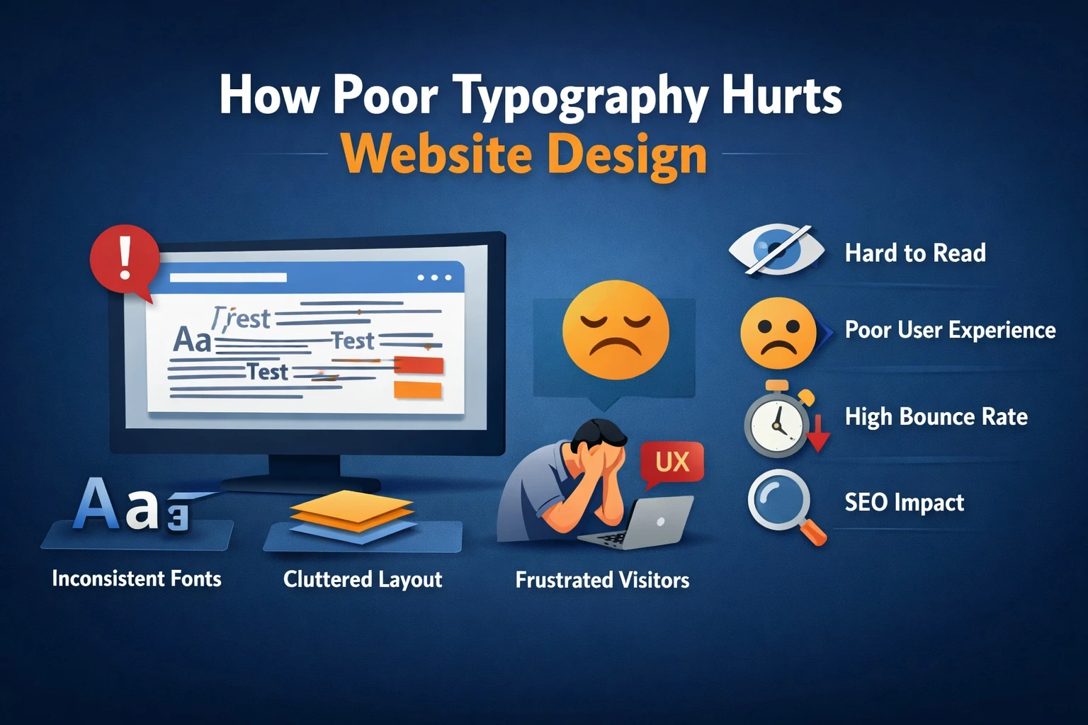
Visitors often leave a website within seconds, not because the services are weak, but because the website design feels uncomfortable to read. Poor typography quietly damages user experience, weakens brand credibility, and causes potential customers to lose interest before taking action.
Typography goes beyond choosing a font in website design. It shapes how users perceive your brand, process information, and decide whether to trust your business. When companies invest in website development but overlook typography, they often face higher bounce rates, reduced engagement, and missed sales opportunities.
Why Typography Matters in Website Design
Typography shapes how users read, scan, and engage with your website. When text appears cluttered, inconsistent, or difficult to read, users feel an immediate sense of friction, even if they cannot clearly identify the reason. That discomfort breaks attention, reduces interest, and ultimately pushes visitors to leave.
Good typography improves
Readability and comprehension
Clear typography allows users to read content effortlessly and understand the message without strain. When text flows naturally with proper spacing and sizing, users absorb information faster and stay engaged longer.
Visual hierarchy
Typography guides users through content by highlighting what matters most. Well-defined headings, subheadings, and body text help visitors scan pages easily and focus on key information and calls to action.
Brand credibility
Consistent and professional typography builds trust. When fonts look polished and intentional, users perceive the brand as reliable and established, while poor typography creates doubt and reduces confidence.
User experience across devices
Optimized typography adapts seamlessly across desktops, tablets, and mobile devices. Responsive font sizing and spacing ensure comfortable reading on every screen, reducing bounce rates and improving overall engagement.
Impact on Sales and Conversions
Typography plays a far bigger role in buying decisions than most businesses realize. It directly affects how users perceive trust, clarity, and comfort : three critical factors that influence conversions.
When typography is poorly executed, even strong offerings can lose impact. Pricing tables that are difficult to scan, cluttered product descriptions, or call-to-action buttons that fail to stand out create friction. Users begin to hesitate, and in digital environments, hesitation often leads to abandonment. Sometimes, even a small moment of doubt is enough to stop a purchase.
For service-based businesses, the consequences are just as significant. Weak typography can reduce form submissions, enquiries, and calls. While users may find the service appealing, inconsistent fonts, poor spacing, or low readability can subtly signal a lack of professionalism. This uncertainty discourages users from taking the next step, even when interest is high. In essence, typography is not just a design choice, it is a conversion tool. Clear, well-structured, and visually balanced typography guides users confidently through your website, helping them trust your brand and take action without hesitation.
Typography vs Business Performance (Comparison Table)
| Typography Element | Poor Typography Impact | Optimized Typography Impact |
| Font choice | Hard to read, unprofessional | Clear, brand-aligned |
| Line spacing | Text feels cramped | Comfortable reading |
| Font size | Users strain to read | Easy scanning |
| Heading hierarchy | Confusing structure | Clear content flow |
| CTA text styling | Low attention | High click-through |
| Mobile readability | High bounce rate | Better engagement |
SEO Connection: Typography and Rankings
Google does not rank websites based on fonts themselves, but it closely monitors how users interact with content. When typography is poorly executed, users struggle to read and navigate the page, which often results in higher bounce rates, shorter dwell time, and weaker engagement signals. These behavioral patterns indicate a poor user experience and can indirectly impact search visibility.
Readable and well-structured content encourages users to stay longer, scroll deeper, and engage more naturally with a website. Clear typography improves content consumption by reducing effort and visual strain, making information easier to understand. As a result, search engines interpret this positive engagement as a signal of content quality, which supports better rankings and increases the likelihood of higher organic conversions.
How to Improve Typography for Better Results
Improving typography is not just about choosing attractive fonts; it is about creating a readable, engaging, and professional user experience that supports conversions and SEO indirectly. Here are key strategies to enhance typography for better results:
1. Choose the Right Fonts
- Select fonts that reflect your brand personality while remaining highly readable.
- Limit the number of font families to maintain consistency and avoid visual clutter.
- Use complementary font pairings for headings, subheadings, and body text to guide the user’s eye.
2. Optimize Font Size and Line Spacing
- Ensure body text is large enough to be comfortably read on both desktop and mobile devices.
- Maintain adequate line height and spacing between paragraphs to prevent text from feeling cramped.
- Adjust heading sizes to create a clear visual hierarchy that organizes information logically.
3. Enhance Readability with Contrast
- Use sufficient contrast between text and background to make content easy to read.
- Avoid light text on light backgrounds or overly dark text on dark backgrounds, which can strain the eyes.
- Highlight important information using bold or color accents without overdoing it.
4. Create a Clear Visual Hierarchy
- Structure content using headings, subheadings, and bullet points to break up text.
- Make headings stand out with size, weight, or color differences so users can quickly scan content.
- Ensure the most important information catches attention first to guide user behavior.
5. Pay Attention to White Space
- Use spacing around text blocks, images, and CTAs to prevent overcrowding.
- White space improves readability and helps users focus on key elements like calls to action.
- A well-spaced layout increases perceived professionalism and reduces cognitive load.
6. Consistency Across the Website
- Apply consistent typography rules across all pages to build a professional, cohesive look.
- Avoid frequent changes in fonts, sizes, or colors, which can confuse users and reduce trust.
7. Optimize for Mobile Devices
- Ensure fonts are responsive and adjust appropriately for different screen sizes.
- Check readability on smartphones and tablets since most users access websites on mobile.
- Avoid overly small text, cramped spacing, or excessively long lines that hurt mobile readability.
FAQs: Typography and Website Performance
What is typography in website design?
Typography refers to how text appears on a website, including font type, size, spacing, alignment, and hierarchy. It affects readability and user experience.
Can poor typography really reduce sales?
Yes. Poor typography reduces trust, clarity, and ease of use, which directly impacts conversions and purchasing decisions.
How many fonts should a website use?
Ideally, one or two fonts are enough. Using more fonts creates visual chaos and hurts readability.
Does typography affect SEO?
Indirectly, yes. Better typography improves engagement metrics like time on page and bounce rate, which influence SEO performance.
Should typography differ for mobile users?
Yes. Mobile typography needs larger font sizes, better spacing, and high contrast for comfortable reading on small screens.
Final Thought
Typography is more than just a design detail; it is a powerful tool that influences user perception, trust, and conversions. Well-chosen fonts, proper spacing, and a clear visual hierarchy make content easier to read, guide visitors through your website, and encourage them to take action. Poor typography can create friction, reduce engagement, and subtly undermine your brand’s credibility.
For businesses that want their website to truly perform, every detail matters including typography. At Pointer Soft Technologies, we specialize in creating websites that are not only visually appealing but also strategically designed to enhance user experience, engagement, and conversions. By combining thoughtful typography, intuitive design, and performance-driven strategies, we help businesses turn visitors into loyal customers and achieve measurable online growth.