A website visitor may love your content, your services, or your products , but unless you guide them toward the next step, they won’t convert. That “next step” depends entirely on your CTA. A well-crafted call-to-action can turn a passive reader into a lead, a buyer, or a long-term customer. This is why mastering CTA best practices is one of the smartest moves you can make to increase conversions and strengthen your brand’s digital performance.
Whether you want users to sign up, buy now, book a demo, or contact your team, your CTA must be clear, compelling, and impossible to ignore. Below is a detailed guide to help you understand how CTAs work and how you can implement the right techniques to boost your conversion rates effectively.
Why CTAs Matter More Than You Think
A CTA is the point where user intention meets business goals. Even if your website design, content, and traffic are excellent, poor CTAs can cause you to lose potential customers. Many businesses underestimate the power of CTA optimization and end up relying on generic buttons that don’t persuade the user to take action.
Strong CTAs reduce confusion, eliminate friction, build motivation, and guide the user toward making a decision. This makes mastering CTA best practices absolutely essential for higher conversions.
7 CTA Best Practices to Boost Your Conversion Rates
1. Make Your CTA Clear and Action-Driven
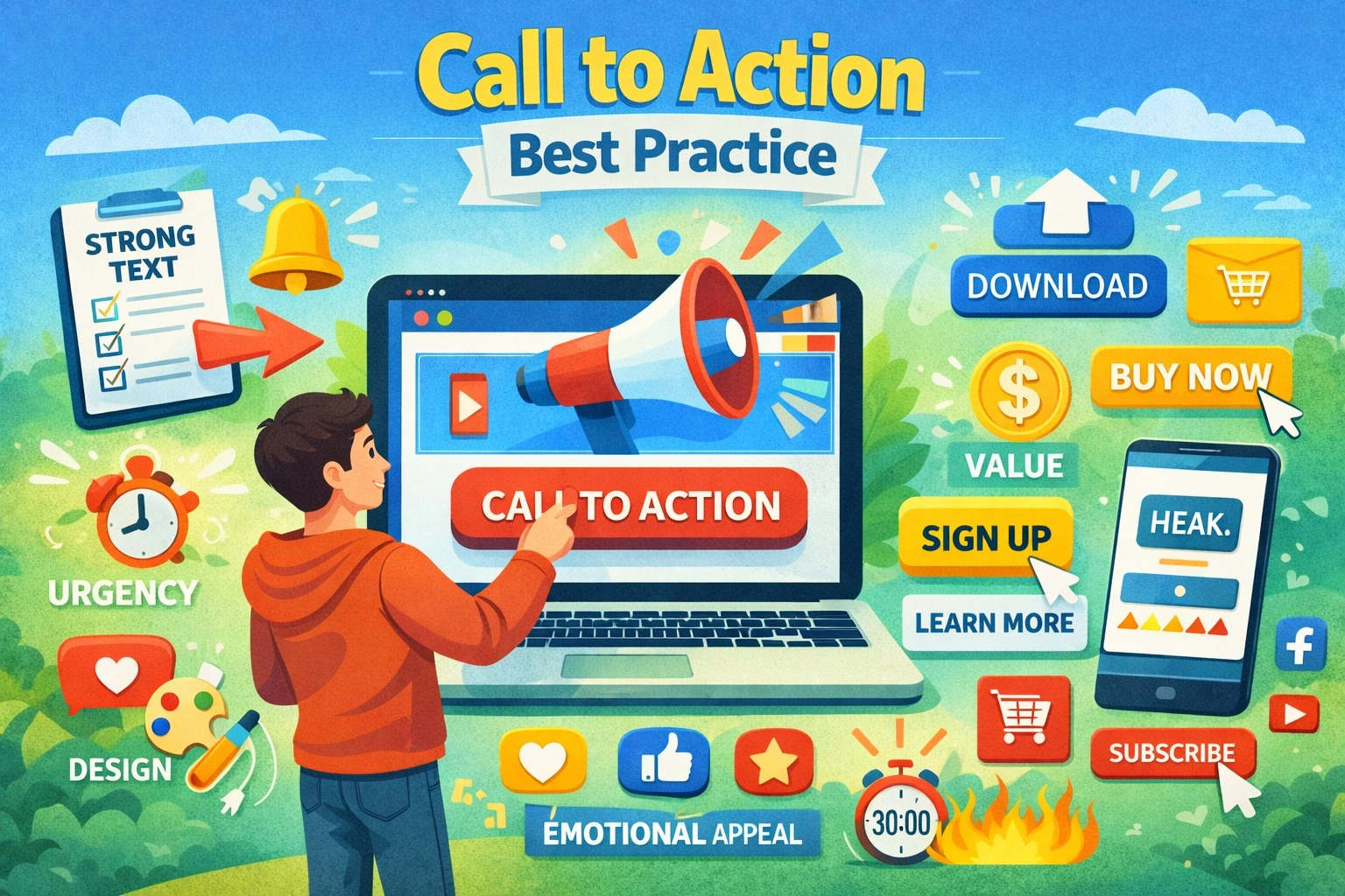
A CTA should instantly communicate what a user will get when they click. Vague or passive wording leads to hesitation. Use strong action verbs that create clarity and urgency. Phrases like Get Started, Claim Your Offer, Book Your Free Call, or Download Instantly work because they tell the user exactly what’s next.
Avoid overly creative or clever phrases that confuse the visitor. Clarity always wins.
2. Keep Your CTA Short and Simple
Great CTAs are usually short—often just two to five words. Long sentences make buttons hard to read and visually unattractive. A short CTA also feels more achievable and reduces psychological pressure on the user. When you keep it simple, the CTA becomes easier for the eye to catch and easier for the mind to accept.
3. Use Contrasting Colors That Stand Out
A CTA button must catch attention instantly without disrupting the aesthetic of your design. The best way to achieve this is by choosing a contrasting color. When the CTA stands out visually, it naturally guides the user’s eyes toward the next step.
Avoid blending your CTA into your background or using low-contrast shades. High-visibility colors combined with bold text dramatically improve your click-through rates.
4. Create a Sense of Urgency and Value
Urgency pushes users to act now instead of later. When properly used, it increases conversions while still maintaining trust. Phrases like Limited Slot, Only Today, Offer Ending Soon, or Join Before Seats Fill encourage fast decision-making.
But urgency alone isn’t enough—you must highlight the value too. Show what the user gains by taking immediate action. Combining urgency with value is one of the most effective CTA best practices for conversions.
5. Place Your CTAs Strategically Across the Page
CTA placement can make or break your conversion success. If your button appears in the wrong spot, users may skip it altogether. The most effective placements include the top of the page, middle sections after valuable information, and the end of the page when users are ready to act.
You can repeat CTAs on longer pages without feeling repetitive as long as the context makes sense. Ensure each CTA appears when the user has enough information to make a decision.
6. Use Social Proof Near Your CTAs
Humans trust actions that others have already taken. When you place testimonials, reviews, ratings, or client logos near your CTAs, you reduce hesitation and improve click-through rates. Social proof works as a trust trigger and reassures users that they’re making the right choice.
For example, placing a testimonial under a Book a Demo button can significantly increase conversion rates.
7. Test and Optimize Your CTAs Regularly
The biggest mistake businesses make is assuming one CTA will work forever. User behavior changes, design trends evolve, and your audience’s expectations shift. This is why continuous testing is one of the most important CTA best practices.
A/B testing helps you compare:
- Color variations
- CTA text
- Button size
- Placement
- Design styling
Small changes can create massive results. The more you test, the more you understand what motivates your audience to convert.
Additional Tips to Improve CTA Performance
A professional CTA should feel natural to the flow of the page. Ensure the surrounding content leads the user toward the action. Also, reduce distractions near your CTA—too many links or too much clutter can divert attention. Aim for a clean, focused design that gives your CTA space to breathe.
Another important element is making your CTA mobile-friendly. Since a large percentage of users browse on mobile, the button must be large enough to tap easily and visible without excessive scrolling.
Frequently Asked Questions (FAQ)
1. What makes a CTA effective?
An effective CTA is clear, action-oriented, visually prominent, and strategically placed. It should motivate users to act immediately.
2. How many CTAs should a page have?
Most pages can have multiple CTAs, but each must align with the content and not overwhelm the visitor. A primary CTA should stand out the most.
3. What color works best for CTA buttons?
There is no universal best color, but the CTA should contrast with your website’s color scheme so it grabs attention instantly.
4. Should I use urgency in my CTAs?
Yes, urgency increases conversions when used ethically. Limited offers or timely action phrases help users act faster.
5. How often should I test my CTAs?
You should test your CTAs regularly—especially when launching campaigns, redesigning pages, or noticing a drop in conversions.
Final Thoughts
Effective CTAs are not just buttons on your website—they are the core of your conversion strategy. When you implement strong CTA best practices, you make every part of your website work toward one goal: getting the user to take meaningful action. Clear wording, bold visuals, strategic placement, urgency, and ongoing testing all contribute to better performance and stronger results. If you want to improve your conversion rates and create high-impact CTAs, professional guidance from Pointer Soft Technologies can help you craft CTAs that deliver real outcomes.