Your customers are already browsing on their phones and every second your website fails to load properly you risk losing them forever. Having a site that simply opens on a mobile screen is not enough. True mobile responsive design ensures a smooth fast and seamless experience on every device from small smartphones to large tablets. If your website is not mobile responsive or struggles to adapt across different screen sizes you are missing out on valuable users conversions and revenue. Now is the time to fix these issues before your competitors take the lead.
This detailed guide highlights the most common mobile responsive design mistakes and shows you how to fix them effectively so your website performs better, ranks higher and converts more users.
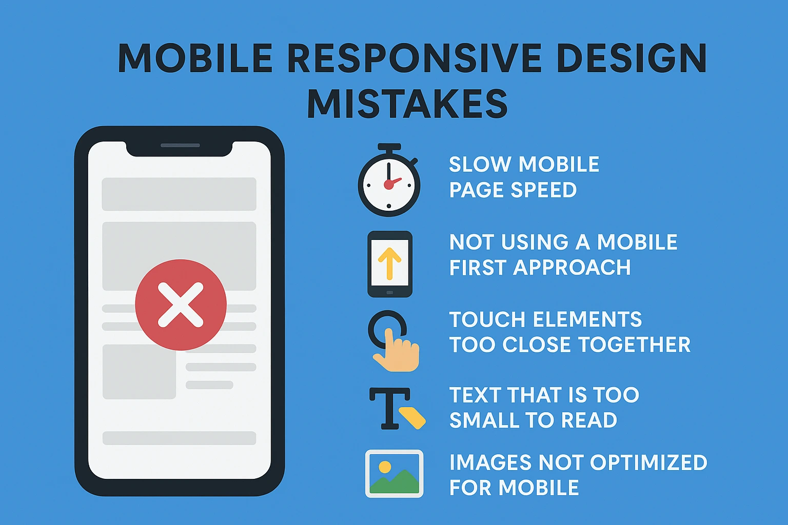
1. Slow Mobile Page Speed
A major issue on many websites is slow loading on mobile devices. Heavy images, poor coding and unnecessary scripts increase load time. When pages take more than three seconds to load, users leave. Slow sites also rank lower on search engines because page speed directly affects SEO.
How to fix it
Compress images before uploading. Remove unused plugins or scripts. Enable browser caching and use modern technology like lazy loading. Make sure your hosting plan supports fast delivery.
2. Not Using a Mobile First Approach
Some websites are designed for desktop screens first and then squeezed to fit smaller screens. This results in clutter, cut off text and unbalanced layouts on mobile. Google now uses mobile first indexing which means the mobile version of your website determines ranking.
How to fix it
Design for smaller screens first. Prioritize essential content. Make layout decisions based on mobile experience and then scale upward for larger screens.
3. Touch Elements Too Close Together
If buttons, links or forms are placed closely, users may click the wrong element. This creates frustration and affects usability. Forms become especially difficult on mobile if fields are too small or unaligned.
How to fix it
Increase spacing around buttons. Use larger tap targets so they are easy to touch with a finger. Keep form fields wide, clear and well spaced.
4. Text That Is Too Small to Read
If users must zoom in to read content, the design is not responsive. Poor font sizing leads to higher bounce rates and low engagement. Mobile users want quick readable information.
How to fix it
Use at least a 16px base font size and adjust line height for readability. Ensure proper contrast between text and background. Place text in blocks that resize efficiently.
5. Images Not Optimized for Mobile
Large high resolution images slow down load time and may not resize properly. Overlapping or broken visuals impact both aesthetics and user experience.
How to fix it
Use responsive image sizes and formats such as WebP. Apply CSS rules to make images scale properly. Test visuals on different screen sizes before final deployment.
6. Ignoring Device Variety
There are hundreds of different screen sizes and aspect ratios. Some websites are tested only on one or two devices and then released assuming everything works perfectly. This leads to broken layouts on certain phones or tablets.
How to fix it
Use responsive breakpoints. Test the website on multiple screen sizes. Use browser testing tools and device preview options to ensure consistency.
7. Hidden or Hard to Find Navigation
If the menu is confusing or buried under layers, users cannot find information. Complicated navigation increases drop offs and hurts conversions.
How to fix it
Use a clean and simple navigation structure. A hamburger menu works effectively when well designed. Keep important links visible and easily clickable.
8. Overloaded Mobile Layout with Too Much Content
Mobile screens have limited space. When too much text, images or pop ups appear, the page looks messy. This distracts users and leads to a poor experience.
How to fix it
Prioritize key content based on user intent. Use short paragraphs. Remove anything that does not support conversions or readability.
9. Failing to Use Responsive Testing During Development
Some businesses only discover issues after launch because they skip testing. Bugs, alignment issues and broken components damage trust and credibility.
How to fix it
Regularly test your layout during development. Use real devices if possible. Tools like Google Chrome DevTools, BrowserStack or responsive design checkers can help catch problems early.
Why Responsive Design Matters
Mobile responsive design is not optional in a competitive digital market. It affects
• First impression and user trust
• Search engine ranking and organic visibility
• Conversion rate and lead generation
• Brand reputation and customer satisfaction
When your website works smoothly across screens, users stay longer and engage more with your content and services. A good mobile experience can directly increase business revenue.
Final Thought
Your audience is browsing on mobile every day and a single small mistake in responsiveness can cost you valuable customers. Identifying and fixing these common mobile responsive design mistakes ensures a smooth fast and user friendly experience that supports business growth. If you want a website that is properly optimized for all devices and delivers strong results online, Pointer Soft Technologies can help you build a high quality responsive design with a focus on performance and conversion.
Frequently Asked Questions
What does mobile responsive design mean ?
It means your website layout and content automatically adjust to fit different screen sizes including mobile phones, tablets and desktops without compromising usability.
Why is responsive design important for SEO ?
Google gives higher ranking to mobile friendly websites because they improve user experience. A non responsive website may lose visibility in search results.
How do I check if my website is mobile responsive ?
You can use the Google Mobile Friendly Test tool or test the website manually on various screen sizes and devices.
Can a non responsive website be fixed or improved ?
Yes. Developers can update the design structure, optimize layouts and implement mobile first techniques to make an existing site responsive.
What is the cost of a mobile responsive website?
Costs vary depending on features, design complexity and technology used. Basic business websites usually have affordable packages while custom solutions are priced higher.